Infatuation
Overview
Infatuation, my go-to resource for when I want the perfect combination of ambiance meets amazing taste, has excellent content for restaurant reviews. But their wayfinding can be difficult, causing a cognitive overload for users in their drop down menu.
In this exploration I improved the user experience by simplifying the "neighborhoods" tab.
Special Thanks to Alex Long for mentoring and feedback.
Team: Solo Project
Client: Infatuation (case study)

Before & After
Since the inception this project Infatuation has since updated their design. To reference their previous look please see the "before" screenshot below to the left, and note there is much more listed the user would have needed to scroll lower to view.
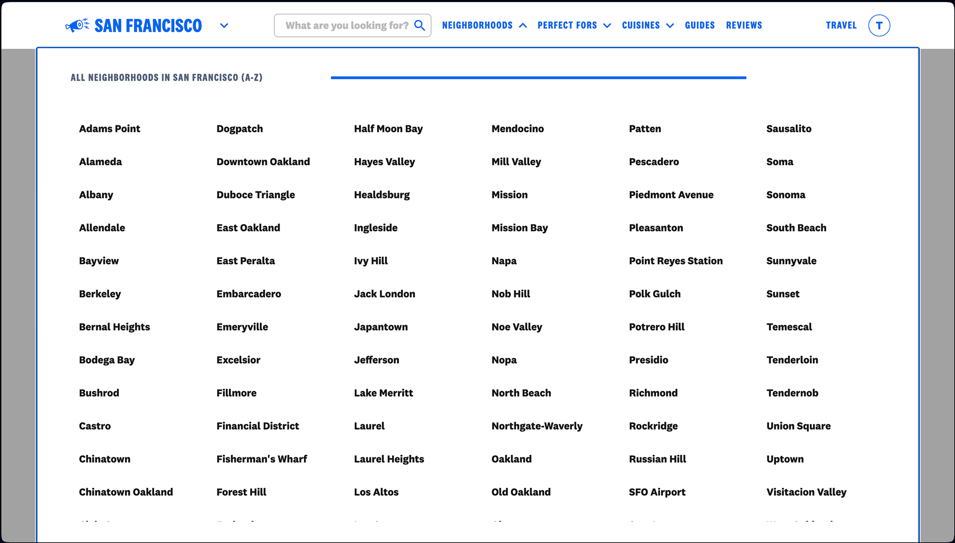
Before
96 locations are listed alphabetically on the Neighborhoods menu!
Alphabetical order is a useful taxonomy since we're accustomed to it and everything is easy to scan, but when it's done with an excessive list of items the organization backfires, making it more difficult for the user. The menu should be to not overwhelm them and make their goal much harder to accomplish.
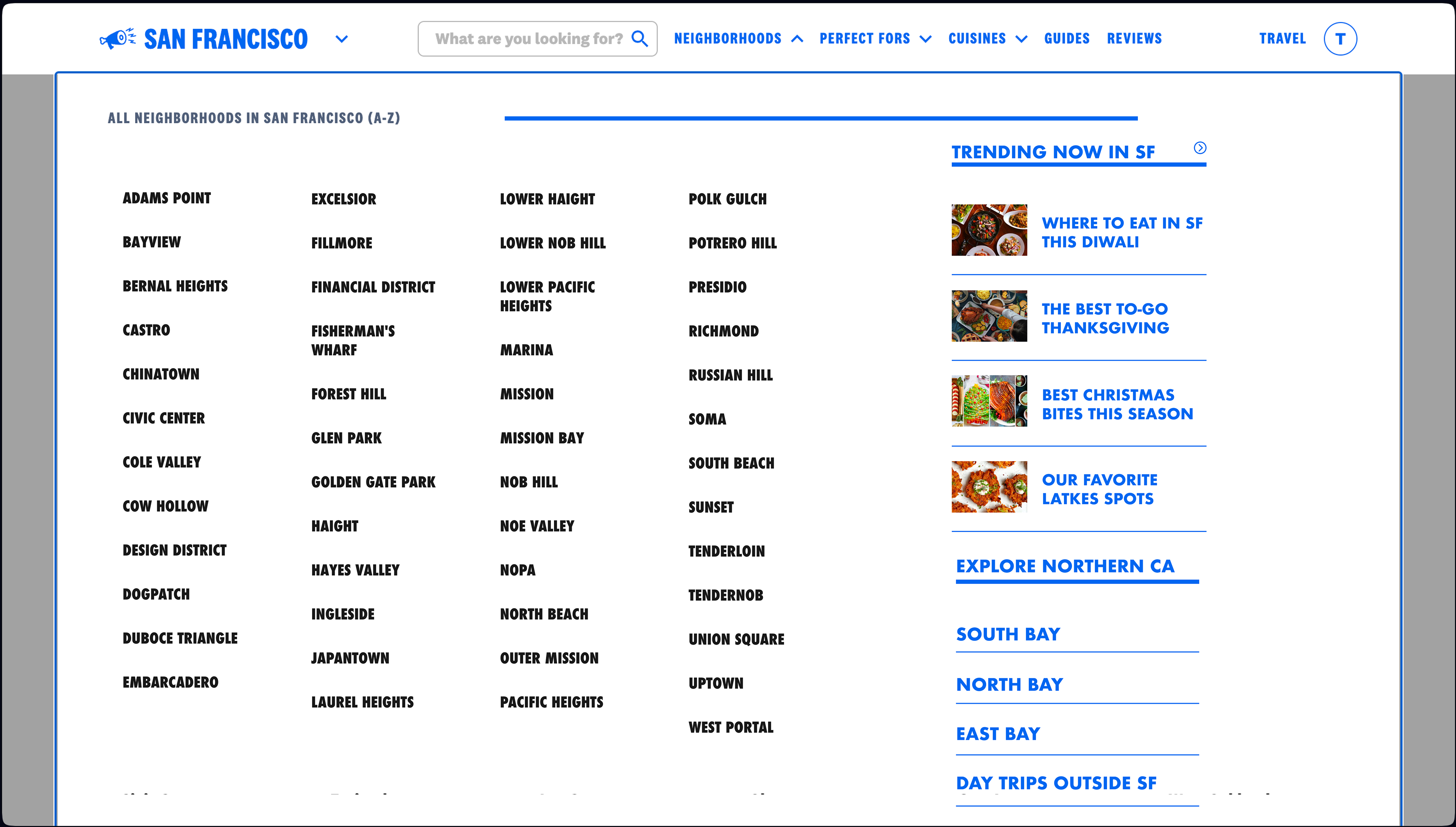
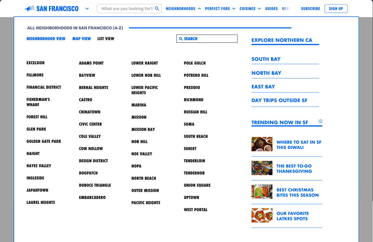
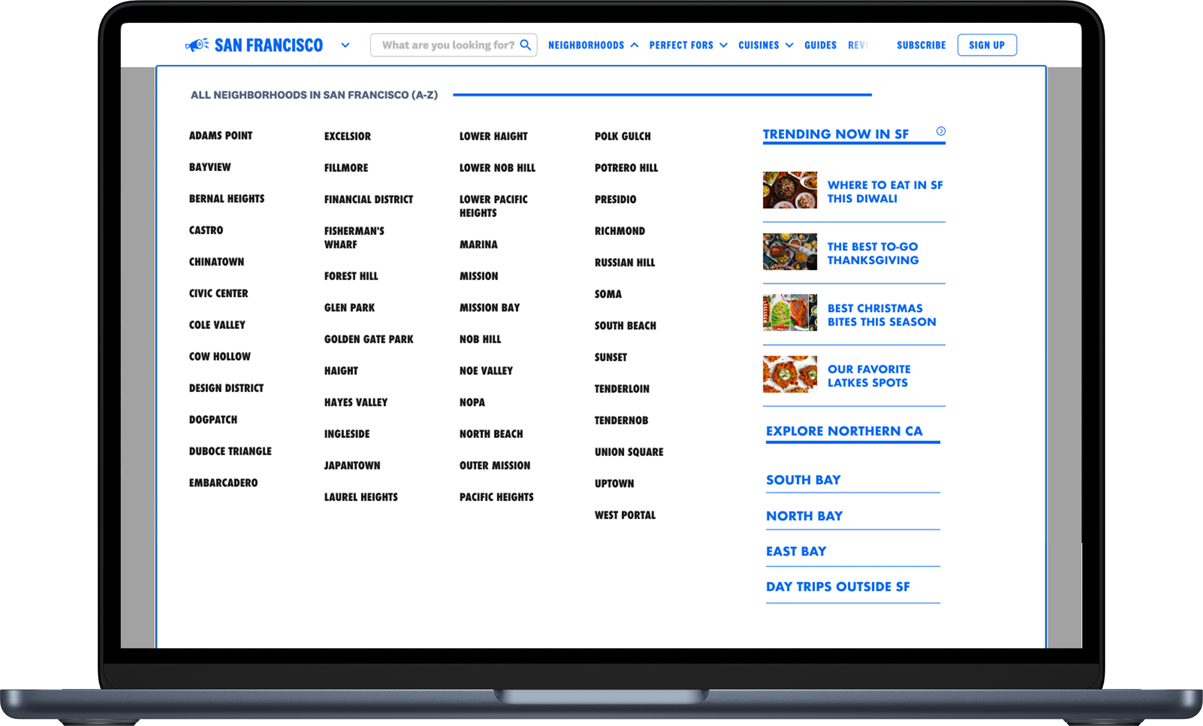
After
Reducing the choices by half is less overwhelming. Now the options are limited to actual San Francisco neighborhoods. By grouping popular options outside of San Francisco under the Explore Northern California and adding a section on Trending, everything is more intuitively organized and consolidated without confusing the purpose of the neighborhoods menu.
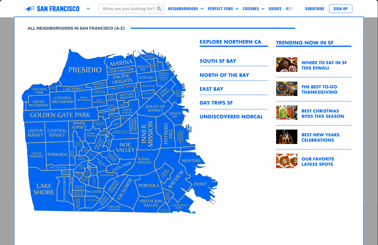
Process
Finding a balance between underwhelming the amount of choices users have to make and organizing by location supported the final iteration seen above. This is why San Francisco city is displayed in the alphabetical list while branching outside of the city to neighboring areas and farther out is listed to the bottom right, with easy access to current trend articles to the top right.
But how did we get here? Let's take a look at some of the other designs...
Explorations
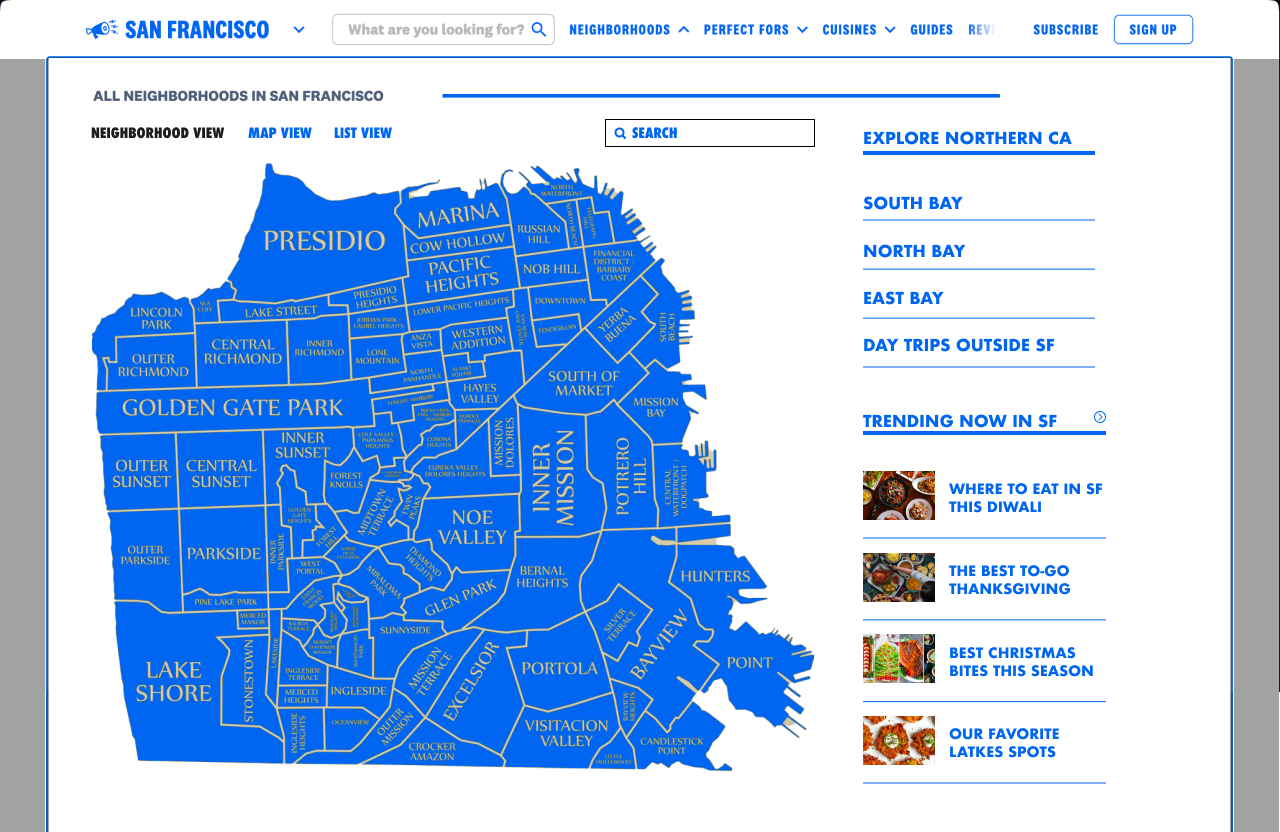
At first a map seemed like the most logical stance. It allows users to select an area geographically based on location and if you're familiar with San Francisco it seemed like a friendly option.
However, a map had various problems such as:
• doesn't benefit those unfamiliar with the city
• creates accessibility issues for proportionally smaller neighborhoods
• creates more work for the backend by bringing in components that likely don't fit into the current web structure.
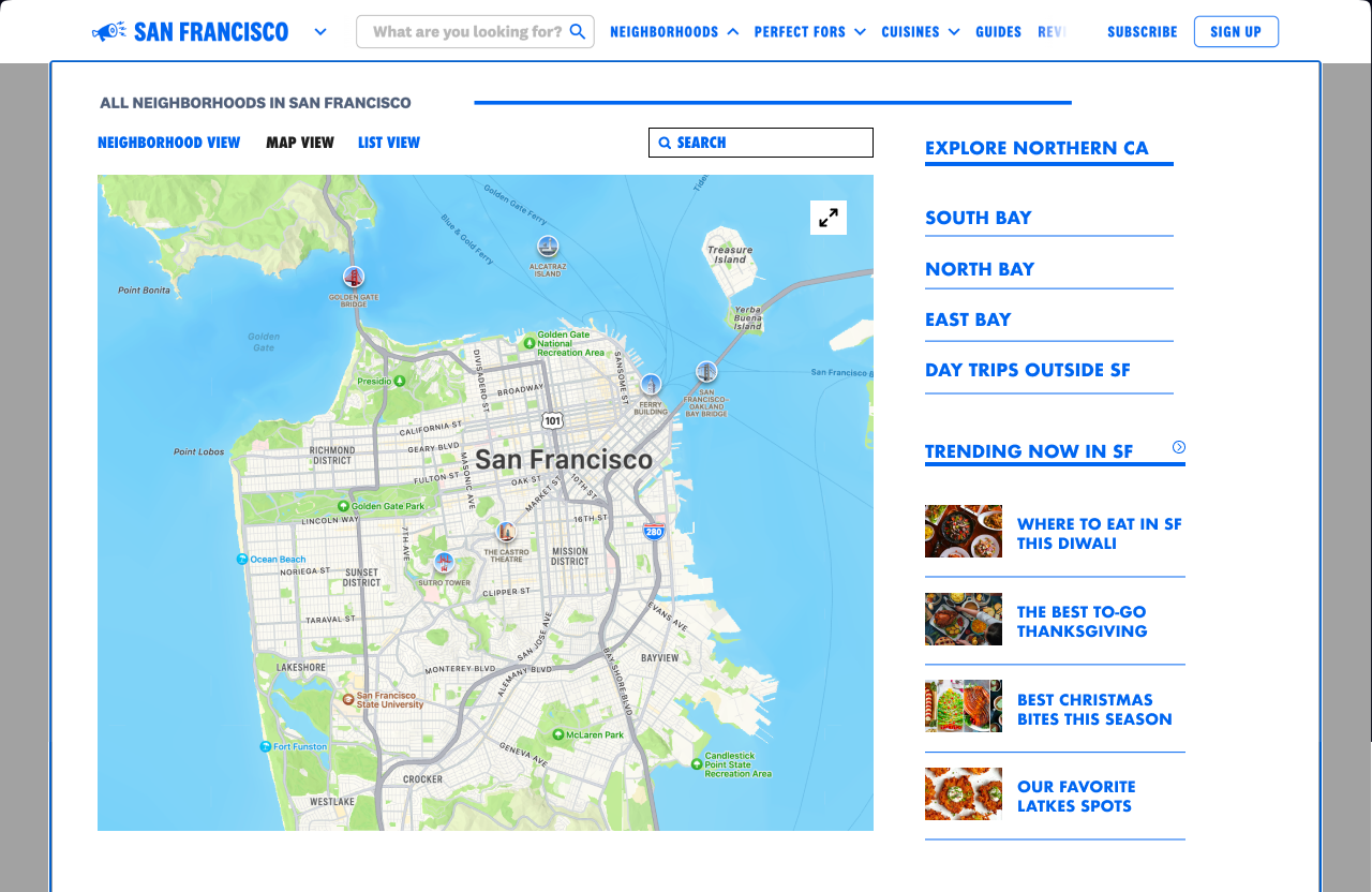
Other explorations combined all three views with tabs: neighborhood map, live map, and list view.
This brought us back to square one because by combing all three choices we have again overwhelmed the user. Additionally this solution creates more work when achieving a solution, while the final option we decided on creates less work for the developers and less cognitive overload for the Infatuation's users.
Final Design
Ultimately the final decision led us to an abbreviated list view containing only the city locations while placing areas outside of SF to the right in four separate categories.
🐱 Tori always stops to admire window cats on her walks 🐱